Of course! Using Python for analysis is one of the most powerful and sought-after skill sets in today's data-driven world. It's the go-to language for data science, business intelligence, and scientific research.

Here’s a comprehensive guide covering why Python, the essential libraries, a typical workflow, and a practical example.
Why Use Python for Analysis?
Python isn't just a programming language; it's a complete ecosystem for data analysis. Here's why it dominates the field:
- Free and Open-Source: Anyone can use it without cost.
- Huge Ecosystem of Libraries: This is Python's superpower. There's a library for almost every task imaginable.
- Gentle Learning Curve: Its syntax is clean, readable, and intuitive, making it easier to learn than languages like R or C++.
- Versatility: It's not just for analysis. You can use the same language for web development, automation, machine learning, and more.
- Strong Community Support: If you get stuck, a quick search will likely lead you to a solution on Stack Overflow or in a tutorial.
- Excellent Integration: Python can easily connect to databases, cloud services, and other software.
The Essential Python Libraries for Analysis
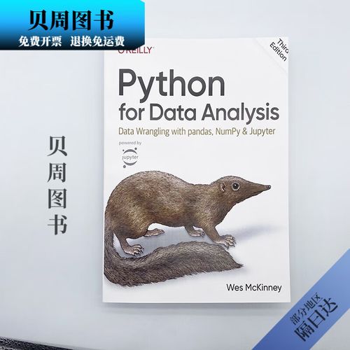
You'll rarely work with just Python. You'll work with a collection of specialized libraries. Here are the core ones you absolutely need to know:
| Library | Purpose | Analogy |
|---|---|---|
| NumPy | Numerical Computing | The engine. Provides powerful N-dimensional arrays and mathematical functions. |
| Pandas | Data Manipulation & Analysis | The toolbox. Lets you load, clean, transform, and analyze structured data (like in spreadsheets or databases). |
| Matplotlib | Basic Plotting & Visualization | The sketchpad. Creates static, customizable plots. |
| Seaborn | Statistical Data Visualization | The artist. Built on Matplotlib, it creates beautiful and informative statistical graphics with less code. |
| Jupyter Notebook/Lab | Interactive Development Environment | Your workshop. Allows you to write code, see output, and add explanations (like Markdown) in a single document. Perfect for exploration and sharing. |
The Typical Data Analysis Workflow in Python
A data analysis project generally follows these steps:

- Setup & Import: Install necessary libraries and import them into your script/notebook.
- Data Loading: Read your data from various sources (CSV files, Excel sheets, SQL databases, APIs).
- Data Inspection (Exploration): Get a first look at your data. What does it contain? Are there any obvious issues?
- Data Cleaning & Preparation: This is often the most time-consuming step. It involves handling missing values, fixing data types, removing duplicates, and creating new features.
- Data Manipulation & Transformation: Filter rows, select columns, group data, and aggregate it to answer specific questions.
- Data Analysis & Modeling: Perform statistical tests, build models, or find patterns and insights.
- Data Visualization: Create charts and graphs to communicate your findings effectively.
- Reporting & Communication: Summarize your results in a clear and concise way.
A Practical Example: Analyzing Sales Data
Let's walk through a mini-analysis using a sample sales dataset.
Step 1: Setup and Import
First, make sure you have the libraries installed:
pip install pandas numpy matplotlib seaborn
Now, let's import them into our Python script or Jupyter Notebook.
import pandas as pd
import numpy as np
import matplotlib.pyplot as plt
import seaborn as sns
# Set a nice style for our plots
sns.set_style("whitegrid")
Step 2: Data Loading
We'll create a sample DataFrame and load it. In a real project, you'd use pd.read_csv('your_file.csv').

# Sample data (in a real scenario, you'd load this from a file)
data = {
    'OrderID': [101, 102, 103, 104, 105, 106, 107, 108],
    'Product': ['Laptop', 'Mouse', 'Keyboard', 'Monitor', 'Laptop', 'Mouse', 'Webcam', 'Monitor'],
    'Category': ['Electronics', 'Electronics', 'Electronics', 'Electronics', 'Electronics', 'Electronics', 'Electronics', 'Electronics'],
    'Region': ['North', 'South', 'North', 'West', 'South', 'West', 'North', 'South'],
    'Sales': [1200, 25, 75, 300, 1500, 30, 150, 350],
    'OrderDate': pd.to_datetime(['2025-01-15', '2025-01-16', '2025-01-17', '2025-02-10', '2025-02-11', '2025-03-05', '2025-03-06', '2025-03-07'])
}
# Create a Pandas DataFrame
df = pd.DataFrame(data)
# Display the first 5 rows
print("First 5 rows of the data:")
print(df.head())
Step 3: Data Inspection
Let's understand our data better.
# Get a concise summary of the DataFrame
print("\nData Info:")
df.info()
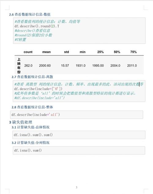
# Get descriptive statistics for numerical columns
print("\nDescriptive Statistics:")
print(df.describe())
# Check for missing values
print("\nMissing Values:")
print(df.isnull().sum())
Step 4: Data Cleaning & Preparation
Let's assume we found some issues. For this example, let's pretend the 'Mouse' in the South region had a missing sales value.
# Introduce a missing value for demonstration
df.loc[1, 'Sales'] = np.nan
print("\nData with a missing value:")
print(df)
# Fill missing values with the mean sales of the product
mean_sales_mouse = df[df['Product'] == 'Mouse']['Sales'].mean()
df['Sales'].fillna(mean_sales_mouse, inplace=True)
print("\nData after filling the missing value:")
print(df)
Step 5: Data Manipulation & Transformation
Let's answer some questions.
Question 1: What are the total sales for each region?
# Group by 'Region' and sum the 'Sales'
total_sales_by_region = df.groupby('Region')['Sales'].sum().sort_values(ascending=False)
print("\nTotal Sales by Region:")
print(total_sales_by_region)
Question 2: What is the average sale price for each product?
# Group by 'Product' and calculate the mean
avg_sales_by_product = df.groupby('Product')['Sales'].mean()
print("\nAverage Sales by Product:")
print(avg_sales_by_product)
Step 6: Data Analysis & Modeling
Let's find the top-performing product.
# The groupby operation above already gives us this information.
top_product = avg_sales_by_product.idxmax()
top_product_sales = avg_sales_by_product.max()
print(f"\nThe top-performing product is the '{top_product}' with an average sale of ${top_product_sales:.2f}.")
Step 7: Data Visualization
A picture is worth a thousand words. Let's visualize our findings.
Visualization 1: Total Sales by Region (Bar Chart)
plt.figure(figsize=(8, 5))
total_sales_by_region.plot(kind='bar', color='skyblue')'Total Sales by Region')
plt.xlabel('Region')
plt.ylabel('Total Sales ($)')
plt.xticks(rotation=0)
plt.tight_layout()
plt.show()
Visualization 2: Sales Trend Over Time (Line Chart)
# First, let's make sure the date is the index
df.set_index('OrderDate', inplace=True)
# Now, we can resample by month and sum the sales
monthly_sales = df['Sales'].resample('M').sum()
plt.figure(figsize=(10, 6))
monthly_sales.plot(kind='line', marker='o', linestyle='-', color='teal')'Monthly Sales Trend')
plt.xlabel('Date')
plt.ylabel('Total Sales ($)')
plt.grid(True)
plt.tight_layout()
plt.show()
Step 8: Reporting & Communication
You would now take the tables, summary statistics, and charts and put them into a presentation, a report, or an interactive dashboard to share your insights with stakeholders. For example:
- "The South region is our top-performing region, generating over $1,800 in sales."
- "Laptops are our highest-selling product by average value."
- "While sales were steady in Q1, there was a noticeable spike in March."
Next Steps and Advanced Topics
Once you're comfortable with the basics, you can explore:
- SQL Integration: Use libraries like
SQLAlchemyorpandas.read_sql_queryto pull data directly from databases. - Statistical Modeling: Dive into
SciPyfor statistical tests andStatsmodelsfor statistical modeling. - Machine Learning: This is where Python truly shines. Use
Scikit-learnfor traditional machine learning andTensorFloworPyTorchfor deep learning. - Big Data: For datasets that don't fit in memory, look into
DaskorPolars. - Automation: Use
SeleniumorBeautifulSoupto scrape data from websites. UseAPSchedulerorAirflowto automate your analysis pipelines.


