Of course! "Python graphing" is a huge and essential part of the data science and scientific computing ecosystem. There isn't a single module called graphingbuilt, but you're likely referring to the powerful, built-in (or easily installable) graphing libraries available in Python.
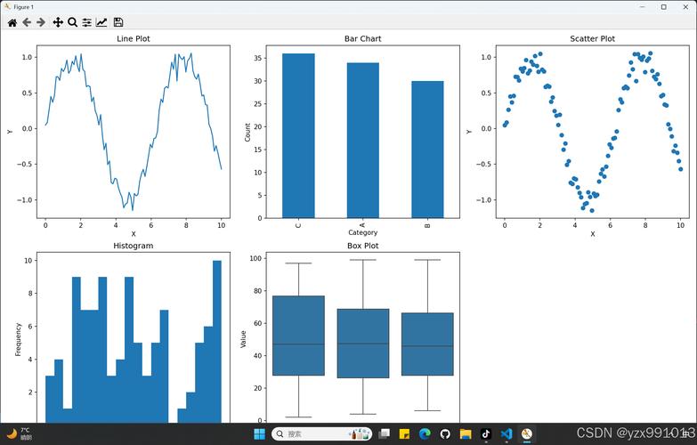
I'll guide you through the most popular and useful ones, from simple and quick to highly advanced.
Here’s a breakdown of the top Python graphing libraries:
Matplotlib: The Foundation
This is the most fundamental and widely used plotting library in Python. It's highly customizable and gives you fine-grained control over every aspect of your plot. Many other libraries (like Seaborn and Pandas plotting) are built on top of it.
Key Features:
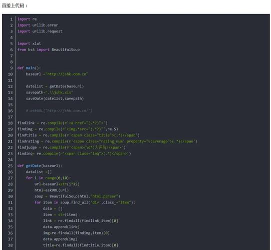
- Full control over plot elements (labels, titles, colors, lines, etc.).
- Can create static, animated, and interactive plots.
- The foundation for the scientific Python stack.
Best for: When you need ultimate control and customization.
Installation:
pip install matplotlib
Example: A Simple Line Plot
import matplotlib.pyplot as plt
import numpy as np
# Data
x = np.linspace(0, 10, 100)
y = np.sin(x)
# Create the plot
plt.plot(x, y, label='sin(x)', color='blue', linestyle='--')
# Add labels and title
plt.xlabel("X-axis")
plt.ylabel("Y-axis")"Sine Wave")
# Add a legend
plt.legend()
# Display the plot
plt.show()
Seaborn: Statistical Data Visualization
Seaborn is built on top of Matplotlib and provides a high-level interface for drawing attractive and informative statistical graphics. It simplifies complex plotting tasks and comes with beautiful default styles.
Key Features:
- Excellent for statistical plots (histograms, box plots, violin plots, heatmaps).
- Works seamlessly with Pandas DataFrames.
- Great for exploring and understanding data distributions.
Best for: Statistical analysis, exploring datasets, and creating publication-quality plots with less code.
Installation:
pip install seaborn
Example: A Scatter Plot with a Regression Line
import seaborn as sns
import matplotlib.pyplot as plt
import pandas as pd
# Load a built-in dataset
tips = sns.load_dataset("tips")
# Create a scatter plot with a regression line
# 'hue' adds color based on a categorical variable
sns.lmplot(x="total_bill", y="tip", data=tips, hue="smoker", height=6)
# Add a title"Tip Amount vs. Total Bill")
# Show the plot
plt.show()
Plotly: Interactive Web-Based Visualizations
Plotly is known for creating interactive, publication-quality graphs. You can hover over data points, zoom in, pan around, and even export plots as standalone HTML files.
Key Features:
- Fully interactive plots (zoom, pan, hover, click).
- Can create complex 3D plots, scientific charts, and statistical figures.
- Integrates well with web applications (Dash, Flask).
Best for: Dashboards, web applications, and when interactivity is key.
Installation:
pip install plotly
Example: An Interactive 3D Scatter Plot
import plotly.express as px
import pandas as pd
# Load the Iris dataset
df = px.data.iris()
# Create a 3D scatter plot
fig = px.scatter_3d(df, x='sepal_length', y='sepal_width', z='petal_width',
                    color='species', symbol='species',
                    title='Interactive 3D Plot of Iris Dataset')
# Show the plot (will open in a new browser tab or a Jupyter Notebook)
fig.show()
Pandas Built-in Plotting
Pandas DataFrames and Series have a built-in .plot() method that is a convenient wrapper around Matplotlib. It's the fastest way to get a basic plot directly from your data.
Key Features:
- Extremely convenient for quick, simple plots.
- Automatically uses Matplotlib as the backend.
- Good for a first look at your data.
Best for: Quick exploratory data analysis (EDA) directly from a DataFrame.
Installation: Matplotlib is a dependency for Pandas, so you likely already have it.
pip install pandas matplotlib
Example: Quick Plotting from a DataFrame
import pandas as pd
import numpy as np
# Create a sample DataFrame
data = {
    'Date': pd.date_range(start='2025-01-01', periods=10),
    'Sales': np.random.randint(50, 200, size=10),
    'Expenses': np.random.randint(20, 100, size=10)
}
df = pd.DataFrame(data)
# Set the date as the index for better plotting
df.set_index('Date', inplace=True)
# Plot multiple columns at once
df.plot(kind='line', figsize=(10, 6), title='Sales vs. Expenses Over Time')
# Show the plot
plt.show()
Summary Table: Which One Should I Use?
| Library | Best For | Key Strength | Ease of Use |
|---|---|---|---|
| Matplotlib | Ultimate control, customization, static plots | The foundation, highly flexible | Medium (more code for simple plots) |
| Seaborn | Statistical analysis, beautiful plots, EDA | High-level interface, great defaults | Easy (concise syntax) |
| Plotly | Interactive dashboards, web apps | Interactivity, 3D plots | Easy (Plotly Express is very simple) |
| Pandas | Quick EDA, direct from DataFrame | Convenience, speed | Very Easy (.plot() is one command) |
A Typical Workflow
- Load Data: Use
pandasto read your data (CSV, Excel, etc.). - Explore: Use the built-in
df.plot()orseabornfor a quick look at distributions and relationships. - Analyze: Use
seabornto create more complex statistical visualizations. - Finalize/Share: Use
matplotlibto fine-tune the final plot's appearance or useplotlyto create an interactive version for a dashboard or report.
Other Notable Libraries
- Bokeh: Similar to Plotly, great for creating interactive plots for web applications, especially large datasets.
- Altair: A declarative statistical visualization library, based on Vega-Lite. It's very intuitive for creating complex plots with a simple, grammar-of-graphics-like syntax.
- Folium: For creating interactive maps, often used for geospatial data.
- Graphviz: For rendering graph structures like trees, networks, and flowcharts.
To get started, I highly recommend installing Matplotlib, Seaborn, and Plotly. This will cover 95% of your graphing needs in Python.

