Of course! Saving a heatmap in Python is a common task, and the best library for the job is Matplotlib, often in combination with Seaborn for more advanced statistical heatmaps.
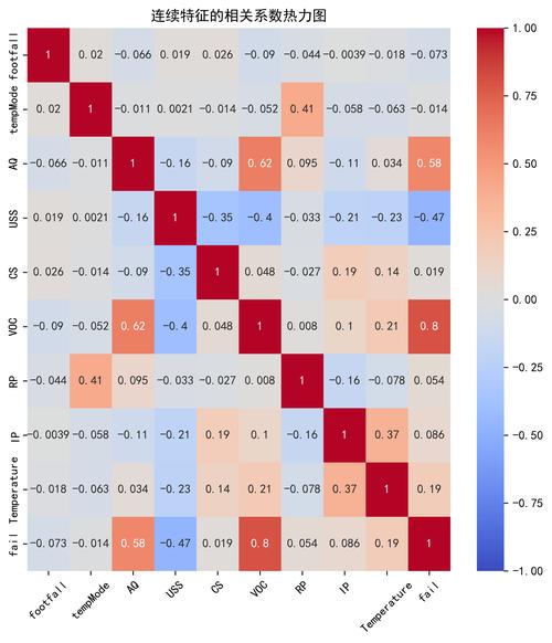
Here’s a complete guide covering the most common scenarios, from basic heatmaps to customizing and saving them in different formats.
The Basic Way: Using plt.savefig()
The fundamental function for saving a Matplotlib figure is plt.savefig(). You create your plot and then call this function to save it to a file.
Simple Matplotlib Heatmap
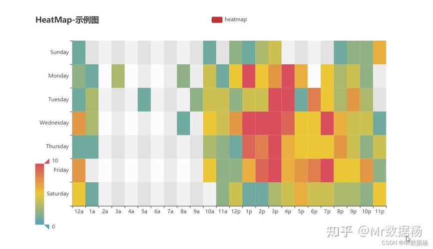
This example creates a basic heatmap from a NumPy array.
import numpy as np
import matplotlib.pyplot as plt
# 1. Create some sample data
data = np.random.rand(10, 10)
# 2. Create the plot
plt.figure(figsize=(8, 6)) # Optional: figure size
heatmap = plt.imshow(data, cmap='viridis')
# 3. Add a color bar
plt.colorbar(heatmap)
# 4. Add titles and labels for clarity"A Simple Heatmap")
plt.xlabel("X-axis Label")
plt.ylabel("Y-axis Label")
# 5. Save the figure to a file
# The filename extension determines the format (e.g., .png, .pdf, .svg)
plt.savefig("simple_heatmap.png")
# 6. Close the plot to free up memory (good practice)
plt.close()
print("Heatmap saved as simple_heatmap.png")
Key Point: You must call plt.savefig() before plt.show() if you want to save the figure. If you call plt.show() first, a new blank figure will be created, and plt.savefig() will save that blank one.
The Recommended Way: Using Object-Oriented Syntax
For more complex plots, it's better to use the object-oriented (OO) approach. This gives you more control over the figure and axes objects.
import numpy as np
import matplotlib.pyplot as plt
# 1. Create some sample data
data = np.random.rand(10, 10)
# 2. Create a figure and an axes object
fig, ax = plt.subplots(figsize=(8, 6))
# 3. Plot the heatmap on the axes object
im = ax.imshow(data, cmap='magma')
# 4. Add a colorbar, which is associated with the image 'im'
fig.colorbar(im, ax=ax)
# 5. Add titles and labels
ax.set_title("A Better-Oriented Heatmap")
ax.set_xlabel("X-axis")
ax.set_ylabel("Y-axis")
# 6. Save the entire figure object
fig.savefig("oriented_heatmap.pdf", dpi=300, bbox_inches='tight')
# 7. Close the figure
plt.close()
print("Heatmap saved as oriented_heatmap.pdf")
Advanced Heatmaps with Seaborn
Seaborn is built on top of Matplotlib and provides high-level functions for beautiful statistical graphics. seaborn.heatmap() is excellent for visualizing matrices, like correlation matrices.
Example 1: Correlation Matrix Heatmap
This is one of the most common use cases for heatmaps.
import seaborn as sns
import matplotlib.pyplot as plt
import pandas as pd
import numpy as np
# 1. Create a sample DataFrame
data = {
    'A': np.random.randn(100),
    'B': np.random.randn(100) * 0.5 + 0.5,
    'C': np.random.randn(100) * -0.8,
    'D': np.random.randn(100) * 1.2
}
df = pd.DataFrame(data)
# 2. Calculate the correlation matrix
corr_matrix = df.corr()
# 3. Create a matplotlib figure
plt.figure(figsize=(10, 8))
# 4. Create the seaborn heatmap
# annot=True writes the data value in each cell
# fmt=".2f" formats the annotation to two decimal places
# linewidths adds space between cells
sns.heatmap(corr_matrix, annot=True, fmt=".2f", linewidths=.5, cmap="coolwarm")
# 5. Add a title"Correlation Matrix Heatmap with Seaborn")
# 6. Save the plot
plt.savefig("correlation_heatmap.png", dpi=200, bbox_inches='tight')
# 7. Close the plot
plt.close()
print("Correlation heatmap saved as correlation_heatmap.png")
Example 2: Heatmap with Annotations and Customization
Seaborn makes it easy to add custom text annotations and control many aspects of the plot.

import seaborn as sns
import matplotlib.pyplot as plt
import numpy as np
# 1. Create sample data
data = np.random.rand(10, 12)
labels = ['Jan', 'Feb', 'Mar', 'Apr', 'May', 'Jun', 'Jul', 'Aug', 'Sep', 'Oct', 'Nov', 'Dec']
ax_labels = ['Group A', 'Group B', 'Group C', 'Group D', 'Group E', 'Group F', 'Group G', 'Group H', 'Group I', 'Group J']
# 2. Create a figure and axes
fig, ax = plt.subplots(figsize=(12, 8))
# 3. Create the heatmap with more customization
sns.heatmap(
    data,
    ax=ax,
    annot=True,          # Show data values in cells
    fmt=".2f",           # Format annotations to two decimal places
    cmap="YlGnBu",       # Color map
    linewidths=0.5,      # Lines between cells
    linecolor='gray',    # Color of the lines
    xticklabels=labels,  # Custom x-axis labels
    yticklabels=ax_labels # Custom y-axis labels
)
# 4. Add titles and labels
ax.set_title("Monthly Performance by Group", fontsize=16)
ax.set_xlabel("Month", fontsize=12)
ax.set_ylabel("Group", fontsize=12)
# 5. Rotate the x-axis labels for better readability
plt.xticks(rotation=45, ha='right')
# 6. Adjust layout to prevent labels from being cut off
plt.tight_layout()
# 7. Save the figure
fig.savefig("annotated_heatmap.svg") # SVG is a vector format, great for publications
plt.close()
print("Annotated heatmap saved as annotated_heatmap.svg")
Key savefig() Parameters Explained
| Parameter | Description | Example |
|---|---|---|
fname |
The filename to save to. The extension (.png, .pdf, .svg) determines the format. |
plt.savefig("my_plot.png") |
dpi |
Dots per inch. Resolution for raster formats like PNG. Higher DPI means larger file size and better quality. | dpi=300 |
format |
The file format (e.g., 'png', 'pdf', 'svg', 'jpg'). Usually inferred from the filename extension. |
format='pdf' |
bbox_inches |
Bounding box in inches. 'tight' tries to figure out the tightest bounding box that contains all plot elements. Highly recommended to avoid labels being cut off. |
bbox_inches='tight' |
transparent |
If True, the background of the plot will be transparent. Useful for overlays. |
transparent=True |
quality |
For JPEG files, a number from 1 (worst) to 95 (best). 95 is the default. | quality=90 |
Summary of Best Practices
- Use the Object-Oriented Style (
fig, ax): It's more robust and flexible, especially for complex plots with multiple subplots. - Call
savefigBeforeshow: Or, even better, avoidplt.show()during a script that is meant to save files. - Use
bbox_inches='tight': This is a simple trick that prevents your titles, labels, and tick labels from being cut off at the edges of the saved image. - Choose the Right Format:
.png: Good for web and general use. Use a highdpi(e.g., 300) for high-quality images..pdfor.svg: Vector formats. They are resolution-independent and perfect for scientific papers and publications where you might need to zoom in without losing quality..jpg: Use with caution due to compression artifacts. Only use if file size is a major concern and image quality is less critical.


