Of course! Plotting a 3D surface in Python is a common task, especially in scientific computing, data analysis, and machine learning. The most popular and powerful library for this is Matplotlib, often used in conjunction with its extension toolkit mplot3d and the numerical computing library NumPy.
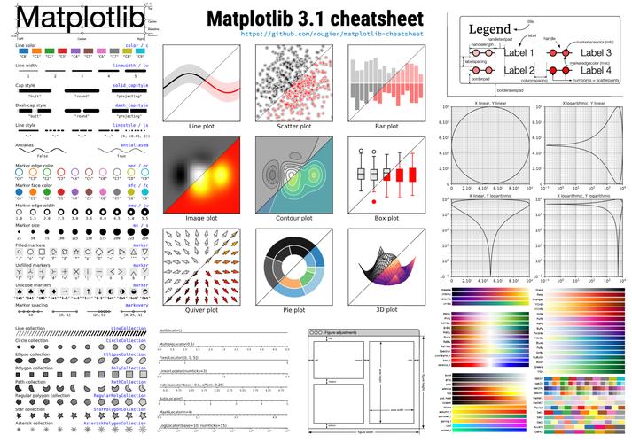
Here’s a comprehensive guide covering:
- The Basic Concept: How surfaces are represented mathematically.
- A Simple Step-by-Step Example: The "Hello, World!" of surface plotting.
- Customization: Adding titles, labels, and color maps.
- More Complex Examples: Plotting a function and a parametric surface.
- Alternative Libraries: A brief look at other tools like Plotly and Mayavi.
The Basic Concept: The Meshgrid
A 3D surface is a function z = f(x, y). To plot it, you need a grid of (x, y) points and calculate the corresponding z value for each point.
XandYMatrices: You can't just use a list of x-values and a list of y-values. You need a 2D grid of x-coordinates and a 2D grid of y-coordinates. This is wherenumpy.meshgrid()comes in. It takes 1D arrays of x and y values and "expands" them into 2D matrices.ZMatrix: This is a 2D matrix where each elementZ[i, j]is the result of applying your function to the correspondingX[i, j]andY[i, j].
Think of it like a spreadsheet:
- The columns of
Xare your x-values. - The rows of
Yare your y-values. - The cell
Z[i, j]is the height of the surface at that(x, y)location.
Simple Step-by-Step Example: A Paraboloid
Let's plot the function z = x² + y².
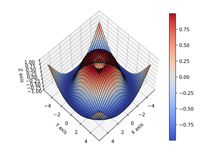
Step 1: Import Libraries
import numpy as np
import matplotlib.pyplot as plt
from matplotlib import cm # Colormaps
from mpl_toolkits.mplot3d import Axes3D # For 3D plotting
Step 2: Create the Data (X, Y, and Z)
We'll create a range of x and y values and then use meshgrid to create our 2D coordinate matrices.
# Define the range for x and y
x = np.linspace(-5, 5, 100)
y = np.linspace(-5, 5, 100)
# Create a meshgrid from the x and y values
X, Y = np.meshgrid(x, y)
# Calculate Z for each point (X, Y)
# Z = X^2 + Y^2
Z = X**2 + Y**2
Step 3: Create the Plot and Surface
Now, we create a figure, add a 3D subplot to it, and plot the surface.
# Create a figure and a 3D Axes object
fig = plt.figure(figsize=(10, 8))
ax = fig.add_subplot(111, projection='3d')
# Plot the surface
# The 'cmap' argument sets the color scheme
# The 'linewidth' and 'antialiased' arguments improve the plot's appearance
surf = ax.plot_surface(X, Y, Z, cmap=cm.viridis,
                       linewidth=0, antialiased=False)
# Add a color bar which maps values to colors
fig.colorbar(surf, shrink=0.5, aspect=5)
# Set labels and title
ax.set_xlabel('X-axis')
ax.set_ylabel('Y-axis')
ax.set_zlabel('Z-axis')
ax.set_title('3D Surface Plot of z = x² + y²')
# Show the plot
plt.show()
Customization and Advanced Features
Let's explore how to make your plots more informative and visually appealing.
a) Different Colormaps (cmap)
Matplotlib has many built-in colormaps. You can change the cmap argument in plot_surface to see different effects.
# Example: Using the 'plasma' colormap
surf = ax.plot_surface(X, Y, Z, cmap=cm.plasma)
Other popular choices: viridis, inferno, magma, cividis, coolwarm.
b) Changing Viewing Angle (view_init)
You can rotate the plot to see it from a different perspective.
# Azimuthal angle (rotation around z-axis) and Elevation angle
ax.view_init(elev=30., azim=45)
c) Plotting a Wireframe
Sometimes a wireframe is clearer than a solid surface. Use plot_wireframe.
fig = plt.figure()
ax = fig.add_subplot(111, projection='3d')
# Use plot_wireframe instead of plot_surface
ax.plot_wireframe(X, Y, Z, color='black', linewidth=0.5)
ax.set_title('Wireframe Plot of z = x² + y²')
plt.show()
More Complex Examples
Example 1: Plotting a Mathematical Function (Sine Waves)
Let's plot z = sin(√(x² + y²)). This creates a ripple effect.
import numpy as np
import matplotlib.pyplot as plt
from matplotlib import cm
from mpl_toolkits.mplot3d import Axes3D
# Create data
x = np.linspace(-10, 10, 200)
y = np.linspace(-10, 10, 200)
X, Y = np.meshgrid(x, y)
# Calculate Z
# np.sqrt calculates the square root element-wise
# np.sin calculates the sine element-wise
Z = np.sin(np.sqrt(X**2 + Y**2))
# Create plot
fig = plt.figure(figsize=(12, 8))
ax = fig.add_subplot(111, projection='3d')
# Plot the surface with a specific colormap
surf = ax.plot_surface(X, Y, Z, cmap=cm.coolwarm,
                       linewidth=0, antialiased=True, rstride=2, cstride=2)
# Add a color bar
fig.colorbar(surf, shrink=0.5, aspect=5)
ax.set_title('3D Surface of z = sin(√(x² + y²))')
ax.set_xlabel('X Axis')
ax.set_ylabel('Y Axis')
ax.set_zlabel('Z Axis')
plt.show()
Note: rstride and cstride can be used to control the sampling frequency of the surface, which can speed up rendering for large datasets.
Example 2: Plotting from Raw Data (e.g., from a CSV)
Imagine you have experimental data with columns X, Y, and Z. The process is similar, but you load the data instead of generating it.
import numpy as np
import matplotlib.pyplot as plt
from matplotlib import cm
from mpl_toolkits.mplot3d import Axes3D
import pandas as pd
# --- Simulate loading data from a file ---
# In a real scenario, you would use: data = pd.read_csv('my_data.csv')
# For this example, let's create some random data
num_points = 100
x_data = np.random.rand(num_points) * 10
y_data = np.random.rand(num_points) * 10
z_data = x_data * np.sin(y_data) + np.random.randn(num_points) * 0.5
# Create a DataFrame (optional, but good practice)
df = pd.DataFrame({'X': x_data, 'Y': y_data, 'Z': z_data})
# --- Create the surface plot ---
# For scatter plots, you can use ax.scatter
fig = plt.figure(figsize=(10, 8))
ax = fig.add_subplot(111, projection='3d')
# Plot the raw data points as a scatter plot
scatter = ax.scatter(df['X'], df['Y'], df['Z'], c=df['Z'], cmap=cm.viridis, marker='o')
# To create a surface from scattered data, you need to interpolate it first.
# This is a more advanced topic, but a simple way is to create a grid and interpolate.
# For simplicity, this example just shows the scatter plot.
# A full interpolation example would use scipy.interpolate.griddata.
# Add labels and title
ax.set_xlabel('X Data')
ax.set_ylabel('Y Data')
ax.set_zlabel('Z Data')
ax.set_title('3D Scatter Plot of Raw Data')
# Add a color bar
fig.colorbar(scatter, shrink=0.5, aspect=5, label='Z Value')
plt.show()
Alternative Libraries
While Matplotlib is fantastic for static, publication-quality 2D and 3D plots, other libraries excel in different areas.
a) Plotly (Best for Interactive Web-Based Plots)
Plotly creates beautiful, interactive plots that can be embedded in websites or viewed in Jupyter notebooks. It's incredibly user-friendly.
import numpy as np
import plotly.graph_objects as go
# Create data (same as the first example)
x = np.linspace(-5, 5, 100)
y = np.linspace(-5, 5, 100)
X, Y = np.meshgrid(x, y)
Z = X**2 + Y**2
# Create the figure
fig = go.Figure(data=[go.Surface(z=Z, x=X, y=Y, colorscale='Viridis')])
# Update layout for better labels
fig.update_layout(title='3D Surface Plot with Plotly',
                  scene=dict(
                      xaxis_title='X-axis',
                      yaxis_title='Y-axis',
                      zaxis_title='Z-axis'
                  ),
                  margin=dict(l=0, r=0, b=0, t=40))
# Show the plot (this will open in a new tab in a script, or inline in a notebook)
fig.show()
b) Mayavi (Best for High-Performance, Large Datasets)
Mayavi is a powerful 3D visualization tool built on VTK. It's designed for rendering very large datasets efficiently and is a favorite in the scientific community (e.g., for computational fluid dynamics, neuroscience).
# You may need to install it first: pip install mayavi
from mayavi import mlab
import numpy as np
# Create data
x, y = np.mgrid[-5:5:100j, -5:5:100j]
z = x**2 + y**2
# Create and display the surface
mlab.surf(x, y, z, colormap='viridis')
# Add axes and title
mlab.axes()'3D Surface with Mayavi')
mlab.show()
Summary: Which Library to Choose?
| Library | Best For | Pros | Cons |
|---|---|---|---|
| Matplotlib | Static plots, publications, integration with the scientific Python stack (NumPy, SciPy, Pandas). | Highly customizable, standard in the Python ecosystem, great for 2D. | 3D plotting can be slow for very large datasets, less interactive. |
| Plotly | Interactive web-based dashboards, Jupyter notebooks, exploratory data analysis. | Very interactive, beautiful by default, easy to embed in web apps. | Can be slower than Matplotlib for static plots, different API. |
| Mayavi | High-performance rendering of massive scientific datasets (e.g., CFD, MRI). | Extremely fast and powerful for large data, advanced features. | Steeper learning curve, heavier dependency, less common for general use. |


