Of course! Here is a comprehensive guide on how to calculate and plot the MACD (Moving Average Convergence Divergence) indicator using Python and the Tushare library.

This guide is broken down into the following parts:
- Prerequisites: What you need to install and set up.
- Getting Stock Data: How to fetch historical stock data using Tushare.
- Calculating MACD: The step-by-step Python code to calculate the MACD line, Signal line, and Histogram.
- Plotting the MACD: How to visualize the MACD along with the stock price.
- Complete Runnable Script: A full script you can copy, paste, and run.
Prerequisites
First, you need to have the necessary Python libraries installed. If you don't have them, open your terminal or command prompt and run:
pip install tushare pandas matplotlib
Tushare Token: Tushare requires an API token to access its data.
- Go to the Tushare website and register for a free account.
- After logging in, navigate to the "个人中心" (Personal Center) page to find your Token.
- Set your token in your Python script using
tushare.set_token('your_token_here').
Getting Stock Data
The first step is to get the historical stock data, which we'll need to calculate the moving averages. We'll use Tushare's pro_bar function to get daily OHLCV (Open, High, Low, Close, Volume) data.
import tushare as ts
import pandas as pd
# Set your Tushare token
# Replace 'your_token_here' with your actual token
ts.set_token('your_token_here')
# Initialize the pro API
pro = ts.pro_api()
# Get stock data, for example, for '000001.SZ' (Ping An Bank)
# You can find other stock codes on the Tushare website
stock_code = '000001.SZ'
start_date = '20250101'
end_date = '20251231'
df = pro.daily(ts_code=stock_code, start_date=start_date, end_date=end_date)
# The data from Tushare might not be sorted by date, so let's sort it
df = df.sort_values('trade_date').reset_index(drop=True)
# For MACD, we primarily need the 'close' price
df['trade_date'] = pd.to_datetime(df['trade_date'])
df.set_index('trade_date', inplace=True)
print(df.head())
Calculating the MACD
The MACD indicator consists of three parts:
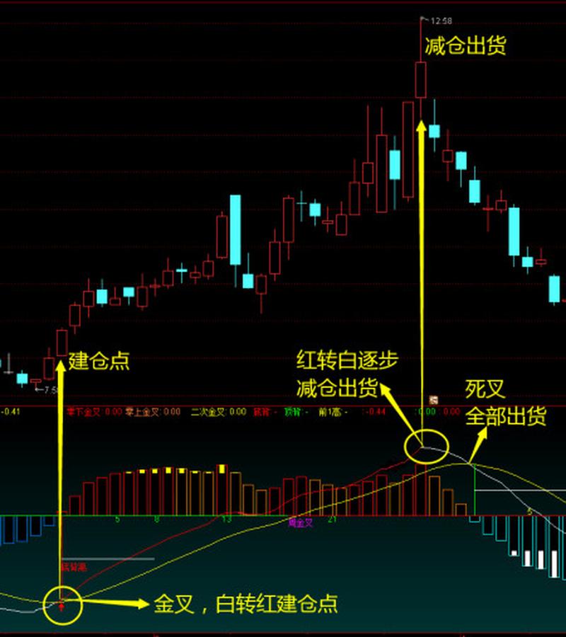
- MACD Line: The difference between the 12-day Exponential Moving Average (EMA) and the 26-day EMA.
- Signal Line: The 9-day EMA of the MACD line.
- Histogram: The difference between the MACD line and the Signal line.
We will use the pandas.DataFrame.ewm() function to calculate the Exponential Moving Averages (EMAs).
Here is the code to calculate these components:
# --- MACD Calculation ---
# Set the typical MACD parameters
short_window = 12  # Short-term EMA period
long_window = 26   # Long-term EMA period
signal_window = 9  # Signal line EMA period
# Calculate the Short Term EMA
df['ema_short'] = df['close'].ewm(span=short_window, adjust=False).mean()
# Calculate the Long Term EMA
df['ema_long'] = df['close'].ewm(span=long_window, adjust=False).mean()
# Calculate the MACD Line (the difference between the short and long EMAs)
df['macd_line'] = df['ema_short'] - df['ema_long']
# Calculate the Signal Line (the 9-day EMA of the MACD line)
df['signal_line'] = df['macd_line'].ewm(span=signal_window, adjust=False).mean()
# Calculate the MACD Histogram (the difference between the MACD line and the signal line)
df['macd_histogram'] = df['macd_line'] - df['signal_line']
# Clean up the DataFrame by dropping the intermediate EMA columns
df.drop(columns=['ema_short', 'ema_long'], inplace=True)
print(df[['close', 'macd_line', 'signal_line', 'macd_histogram']].tail())
Explanation of adjust=False:
When calculating EMAs, adjust=False uses a more computationally efficient formula that is standard for technical analysis. It's equivalent to the "recursive" formula often used in trading platforms. adjust=True would account for all past data points in each calculation, which is less common for this type of analysis.
Plotting the MACD
Visualizing the MACD is crucial for analysis. We'll use matplotlib to create a plot with two subplots:
- The top subplot will show the stock's closing price.
- The bottom subplot will show the MACD line, Signal line, and the histogram.
import matplotlib.pyplot as plt
# --- Plotting ---
# Create a figure and a set of subplots
fig, (ax1, ax2) = plt.subplots(2, 1, figsize=(12, 8), sharex=True)
# --- Subplot 1: Stock Price ---
ax1.plot(df.index, df['close'], label='Close Price', color='blue', alpha=0.6)
ax1.set_title(f'{stock_code} Stock Price and MACD')
ax1.set_ylabel('Price (Yuan)')
ax1.legend()
ax1.grid(True)
# --- Subplot 2: MACD ---
# Plot the MACD line and the Signal line
ax2.plot(df.index, df['macd_line'], label='MACD Line', color='blue', linewidth=1.5)
ax2.plot(df.index, df['signal_line'], label='Signal Line', color='red', linewidth=1.5)
# Plot the MACD histogram
# Use different colors for positive and negative histogram bars
colors = np.where(df['macd_histogram'] >= 0, 'green', 'red')
ax2.bar(df.index, df['macd_histogram'], color=colors, label='MACD Histogram', width=0.8)
ax2.set_ylabel('MACD')
ax2.legend()
ax2.grid(True)
# Improve layout and display the plot
plt.tight_layout()
plt.show()
Note: You'll need to import numpy as np for the np.where function to work.
Complete Runnable Script
Here is the complete, self-contained script. Just replace 'your_token_here' with your actual Tushare token.
import tushare as ts
import pandas as pd
import numpy as np
import matplotlib.pyplot as plt
# ==============================================================================
# 1. SETUP
# ==============================================================================
# Set your Tushare token
# IMPORTANT: Replace 'your_token_here' with your actual token from tushare.pro
ts.set_token('your_token_here')
pro = ts.pro_api()
# Define stock and time parameters
stock_code = '000001.SZ'  # Example: Ping An Bank
start_date = '20250101'
end_date = '20251231'
# Define MACD parameters
short_window = 12
long_window = 26
signal_window = 9
# ==============================================================================
# 2. DATA FETCHING
# ==============================================================================
print(f"Fetching data for {stock_code} from {start_date} to {end_date}...")
df = pro.daily(ts_code=stock_code, start_date=start_date, end_date=end_date)
# Data cleaning and preparation
df = df.sort_values('trade_date').reset_index(drop=True)
df['trade_date'] = pd.to_datetime(df['trade_date'])
df.set_index('trade_date', inplace=True)
print("Data fetched successfully.")
print(df.head())
# ==============================================================================
# 3. MACD CALCULATION
# ==============================================================================
print("\nCalculating MACD components...")
# Calculate EMAs
df['ema_short'] = df['close'].ewm(span=short_window, adjust=False).mean()
df['ema_long'] = df['close'].ewm(span=long_window, adjust=False).mean()
# Calculate MACD Line
df['macd_line'] = df['ema_short'] - df['ema_long']
# Calculate Signal Line
df['signal_line'] = df['macd_line'].ewm(span=signal_window, adjust=False).mean()
# Calculate MACD Histogram
df['macd_histogram'] = df['macd_line'] - df['signal_line']
# Drop intermediate columns for a cleaner view
df.drop(columns=['ema_short', 'ema_long'], inplace=True)
print("MACD calculation complete.")
print(df[['close', 'macd_line', 'signal_line', 'macd_histogram']].tail())
# ==============================================================================
# 4. PLOTTING
# ==============================================================================
print("\nGenerating plot...")
# Create a figure and a set of subplots
fig, (ax1, ax2) = plt.subplots(2, 1, figsize=(14, 10), sharex=True)
fig.suptitle(f'{stock_code} Price and MACD Analysis ({start_date} to {end_date})', y=1.02)
# --- Subplot 1: Stock Price ---
ax1.plot(df.index, df['close'], label='Close Price', color='blue', alpha=0.7)
ax1.set_title('Stock Price')
ax1.set_ylabel('Price (Yuan)')
ax1.legend()
ax1.grid(True, linestyle='--', alpha=0.6)
# --- Subplot 2: MACD ---
# Plot the MACD line and the Signal line
ax2.plot(df.index, df['macd_line'], label='MACD Line', color='blue', linewidth=1.5)
ax2.plot(df.index, df['signal_line'], label='Signal Line', color='red', linewidth=1.5)
# Plot the MACD histogram with color coding
colors = np.where(df['macd_histogram'] >= 0, 'green', 'red')
ax2.bar(df.index, df['macd_histogram'], color=colors, label='MACD Histogram', width=0.8)
ax2.set_title('MACD')
ax2.set_ylabel('MACD Value')
ax2.set_xlabel('Date')
ax2.legend()
ax2.grid(True, linestyle='--', alpha=0.6)
# Improve layout and display the plot
plt.tight_layout()
plt.show()
print("Plot displayed.")
This script will fetch the data, calculate the indicator, and produce a professional-looking chart, giving you a solid foundation for MACD analysis in Python.

