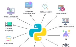
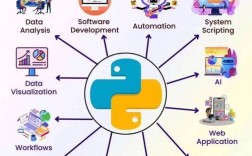
Of course! "Python for data analysis" is one of the most common and powerful uses of the language. It has become the de facto standard in the industry, largely thanks to a rich ecosystem of libraries.

This guide will walk you through the core concepts, essential libraries, and a typical workflow for data analysis in Python.
The Core Idea: Why Python?
Data analysis is the process of inspecting, cleaning, transforming, and modeling data to discover useful information, inform conclusions, and support decision-making.
Python is perfect for this because:
- Easy to Learn: Its readable syntax makes it accessible for beginners.
- Powerful Libraries: A collection of dedicated libraries provides powerful, high-performance tools for every step of the analysis.
- Versatility: You can go from simple data exploration to building complex machine learning models all within the same language.
- Community and Integration: A massive community means tons of tutorials, support, and easy integration with other tools (like databases, web apps, and reporting tools).
The Essential Python Data Analysis Ecosystem
You don't need to reinvent the wheel. The power of Python for data analysis comes from a few key libraries. Here are the "big four" you'll use most often.

A. NumPy: The Foundation for Numerical Computing
NumPy (Numerical Python) is the fundamental package for scientific computing in Python. It provides a powerful N-dimensional array object, which is a more efficient and feature-rich version of Python's built-in lists.
- What it does: Provides the basic data structure (the
ndarray) and mathematical functions that all other libraries are built upon. - Key Features:
- Efficient Array Operations: Performs operations on entire arrays at once, much faster than looping through lists.
- Vectorization: The core concept of applying operations to entire arrays without explicit loops.
- Broadcasting: A clever set of rules for performing operations on arrays of different shapes.
Example:
import numpy as np
# Create a list
python_list = [1, 2, 3, 4, 5]
# Convert it to a NumPy array
numpy_array = np.array(python_list)
# Perform a vectorized operation (no loops needed!)
# This squares every element in the array
squared_array = numpy_array ** 2
print(squared_array) # Output: [ 1  4  9 16 25]
B. Pandas: The Heart of Data Analysis
Pandas is built on top of NumPy and is the most important library for data manipulation and analysis in Python. It introduces two primary data structures: the Series (1D) and the DataFrame (2D).
- What it does: Provides data structures and functions needed to manipulate structured data, like time series, tabular data, and matrix data.
- Key Features:
- DataFrame: A powerful 2D table with labeled axes (rows and columns), similar to a spreadsheet or a SQL table.
- Reading/Writing Data: Easily read from and write to CSV, Excel, SQL databases, and more.
- Data Cleaning: Handle missing values, filter rows, clean strings, and more.
- Data Transformation: Group data, pivot tables, merge datasets, and create new columns.
Example:

import pandas as pd
# Create a simple DataFrame from a dictionary
data = {'Name': ['Alice', 'Bob', 'Charlie', 'David'],
        'Age': [25, 30, 35, 28],
        'City': ['New York', 'Los Angeles', 'Chicago', 'Houston']}
df = pd.DataFrame(data)
# Display the first 2 rows
print("Head of the DataFrame:")
print(df.head(2))
# Select a single column
ages = df['Age']
print("\nAges column:")
print(ages)
# Filter rows (e.g., find people older than 28)
older_than_28 = df[df['Age'] > 28]
print("\nPeople older than 28:")
print(older_than_28)
C. Matplotlib & Seaborn: The Visualization Toolkit
A picture is worth a thousand words. These libraries help you create static, interactive, and publication-quality visualizations.
- Matplotlib: The foundational plotting library. It's very powerful but can be a bit verbose.
- Seaborn: Built on top of Matplotlib, it provides a high-level interface for drawing attractive and informative statistical graphics. It's often simpler to use and produces more aesthetically pleasing plots by default.
Example:
import matplotlib.pyplot as plt
import seaborn as sns
import pandas as pd
# Use the DataFrame from the previous example
data = {'Name': ['Alice', 'Bob', 'Charlie', 'David'],
        'Age': [25, 30, 35, 28],
        'City': ['New York', 'Los Angeles', 'Chicago', 'Houston']}
df = pd.DataFrame(data)
# --- Matplotlib Example ---
plt.figure(figsize=(6, 4))
plt.bar(df['Name'], df['Age'])'Age of Individuals (Matplotlib)')
plt.xlabel('Name')
plt.ylabel('Age')
plt.show()
# --- Seaborn Example ---
plt.figure(figsize=(6, 4))
sns.barplot(x='Name', y='Age', data=df, palette='viridis')'Age of Individuals (Seaborn)')
plt.show()
D. Jupyter Notebook: The Interactive Environment
While not a library, Jupyter is an essential tool for data analysis. It's a web-based interactive computing environment that allows you to create and share documents that contain live code, equations, visualizations, and narrative text.
- Why use it?
- Interactive Exploration: You can run code in small, incremental steps and see the results immediately.
- Storytelling: You can mix code, output (like tables and plots), and Markdown text to create a complete data narrative.
- Great for Learning: Perfect for experimenting with data and sharing your findings.
A Typical Data Analysis Workflow in Python
Here’s a step-by-step process you'll follow for most data analysis projects.
Step 1: Setup and Installation
First, you need to install these libraries. It's highly recommended to use a virtual environment.
# Create a virtual environment (optional but good practice)
python -m venv data_env
# Activate it
# On Windows:
data_env\Scripts\activate
# On macOS/Linux:
source data_env/bin/activate
# Install the necessary libraries
pip install numpy pandas matplotlib seaborn jupyterlab
Step 2: Import Data
Use Pandas to load your data from a file (like a CSV) into a DataFrame.
import pandas as pd
# Load data from a CSV file
# Make sure you have a 'data.csv' file in the same directory
try:
    df = pd.read_csv('data.csv')
except FileNotFoundError:
    print("Error: 'data.csv' not found. Creating a sample DataFrame instead.")
    # Create a sample DataFrame for demonstration
    data = {'Product': ['A', 'B', 'C', 'A', 'B', 'C'],
            'Sales': [100, 150, 120, 200, 180, 250],
            'Region': ['East', 'West', 'East', 'West', 'East', 'West']}
    df = pd.DataFrame(data)
print("Data loaded successfully!")
print(df.head())
Step 3: Data Inspection and Cleaning
This is often the most time-consuming step. You need to understand your data and fix any issues.
# Get a quick overview of the DataFrame
print("\nDataFrame Info:")
df.info()
# Get descriptive statistics for numerical columns
print("\nDescriptive Statistics:")
print(df.describe())
# Check for missing values
print("\nMissing Values:")
print(df.isnull().sum())
# --- Data Cleaning Example ---
# Let's say the 'Sales' column had missing values (NaNs)
# We could fill them with the mean sales value
# df['Sales'].fillna(df['Sales'].mean(), inplace=True)
Step 4: Data Exploration and Transformation (Manipulation)
Now, dig deeper into the data. Filter, group, and create new features to find insights.
# Filter data: Find sales for the 'East' region
east_sales = df[df['Region'] == 'East']
print("\nSales in the East Region:")
print(east_sales)
# Group data: Calculate total sales per product
product_sales = df.groupby('Product')['Sales'].sum().reset_index()
print("\nTotal Sales per Product:")
print(product_sales)
# Create a new feature: Profit (assuming a 20% profit margin)
df['Profit'] = df['Sales'] * 0.20
print("\nDataFrame with new 'Profit' column:")
print(df.head())
Step 5: Data Visualization
Create plots to visualize your findings and communicate them effectively.
import seaborn as sns
import matplotlib.pyplot as plt
# Visualize total sales per product
plt.figure(figsize=(8, 5))
sns.barplot(x='Product', y='Sales', data=product_sales, palette='coolwarm')'Total Sales per Product')
plt.xlabel('Product')
plt.ylabel('Total Sales')
plt.show()
# Visualize sales distribution by region
plt.figure(figsize=(8, 5))
sns.boxplot(x='Region', y='Sales', data=df)'Sales Distribution by Region')
plt.xlabel('Region')
plt.ylabel('Sales')
plt.show()
Step 6: Interpretation and Reporting
Look at your visualizations and numbers. What story do they tell?
- "Product C has the highest total sales."
- "Sales in the West region are more consistent than in the East."
- "Our overall profit margin is healthy at 20%."
You can then use Jupyter Notebook's Markdown cells to write down your interpretations, creating a complete report from code to conclusion.
Next Steps and Further Learning
Once you're comfortable with the basics, you can expand into more advanced areas:
- Scikit-learn: The go-to library for machine learning. It provides simple and efficient tools for data mining and data analysis.
- SQLAlchemy: For connecting Python to SQL databases and running queries directly from your code.
- Plotly & Dash: For creating interactive, web-based dashboards.
- Advanced Pandas: Learn about time series analysis, multi-indexing, and more complex data manipulations.
- Big Data Tools: Learn about Dask (for parallel computing on larger-than-memory datasets) and PySpark (for using Apache Spark with Python).